
What The Flutter’s brand identity is built around creativity in motion.
Ideas that start as raw strokes of inspiration and evolve into polished digital experiences. The signature paint-stroke elements in the motion design embody this spirit:
expressive, handcrafted marks that reveal the energy, experimentation, and momentum behind every project.
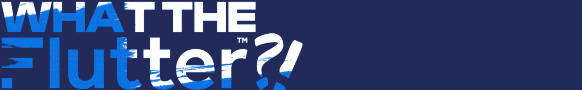
Set in the bold, sculptural forms of Clash Display, the typography adds a strong contemporary edge. Its sharp lines and confident weight ground the brand’s more fluid elements, creating a dynamic contrast: structure meets spontaneity.
Together, the blue palette, handcrafted stroke animations, and assertive typeface build a visual language that feels imaginative, modern, and unmistakably human—perfectly capturing what What The Flutter stands for.
From a design point of view, What The Flutter brings that edge to life through motion.
The bold blue palette anchors the brand with clarity and confidence, while handcrafted paint-stroke elements inject energy, texture, and personality.
In the edit, these strokes become visual catalysts—adding speed, rhythm, and momentum that reflect the pace at which ideas move across the business.